
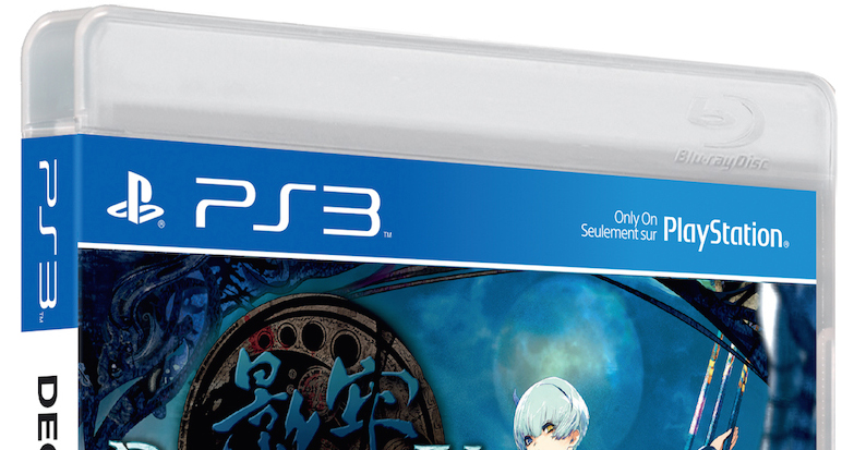
A few years into the PlayStation 3’s life-cycle, Sony redesigned the packaging for games; they abandoned the “Spider-Man” font for the console and box art, the left title bar moved to the top, and the cases stayed the same, equatable to thick Blu-Ray cases. They did a similar thing for the PlayStation Portable a few years into their run, so it’s not uncommon for Sony to refresh their designs. Microsoft did it years into the run of the Xbox 360, but Nintendo hasn’t made major changes to their stock art since the Nintendo Entertainment System days.
With the PlayStation 4 and PlayStation Vita out on shelves, Sony’s decided it’s time to bring the only console they support with physical releases that’s not part of the family of “blue labels” into it (the PSP’s last physical release was Sweet Fuse: At Your Side, and thus the system’s library never attained blue labeling.)
With the reveal of Deception IV: Blood Ties‘ box art, IGN has learned that this new design language is here for the future (and it’s not hard to imagine, but until the end of) of the PlayStation 3’s life cycle.
RocketNews24 shows that the change is in effect in Japan as well, and posits the confusion with the same title; if you scale the art for the same game on two different systems, the difference is small. Admittedly, all three libraries have different cases, and Vita titles are significantly smaller, but uninformed parties (particularly, those buying gifts) might just not catch the difference.
Chad Bonin
@chadbonin
Latest posts by Chad Bonin (see all)
- Batman: Arkham Knight to rise June 2nd - 8 September 2024
- Monster Monpiece Review - 2 September 2024
- What if Nintendo bought Capcom? - 29 August 2024